AudaExplore
AudaExplore is a technology-driven company focused on delivering the fastest claims outcomes and an exceptional experience for vehicle owners and their insurance partners. They needed a user-centric website that clearly communicated their capabilities, differentiated their products, and guided customers to the right solutions.
For this project, my team and I immersed ourselves in the AudaExplore client perspective to fully understand their goals, challenges, and customers. We applied human-centered design principles throughout the process—starting with research and persona development to ensure the website reflected the real needs of its users.
I led the team through stakeholder interviews, audience analysis, and persona creation. Our research revealed that the primary target audience consisted of mid-aged professionals working within the following insurance markets:
1) Insurance Careers
2) Repairers
3) Dealerships
4) Fleet Owners
Client
Auda Explore
My Role
Design, UX

Site Map & Wireframes
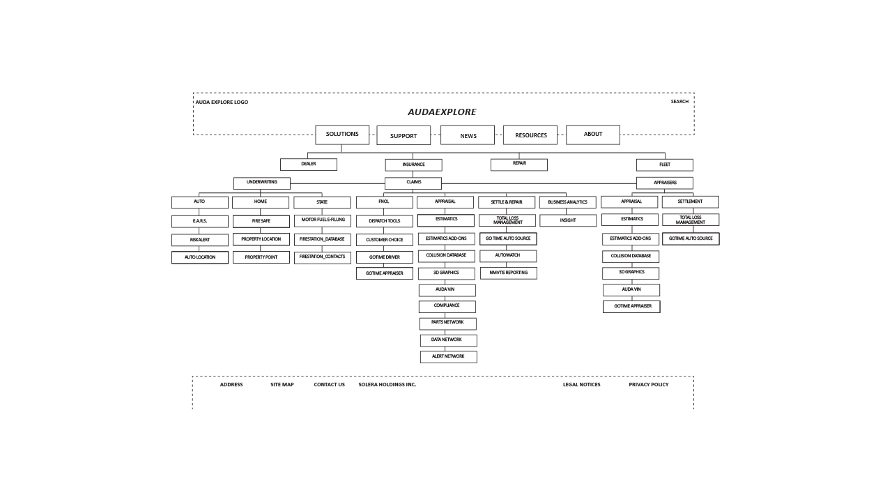
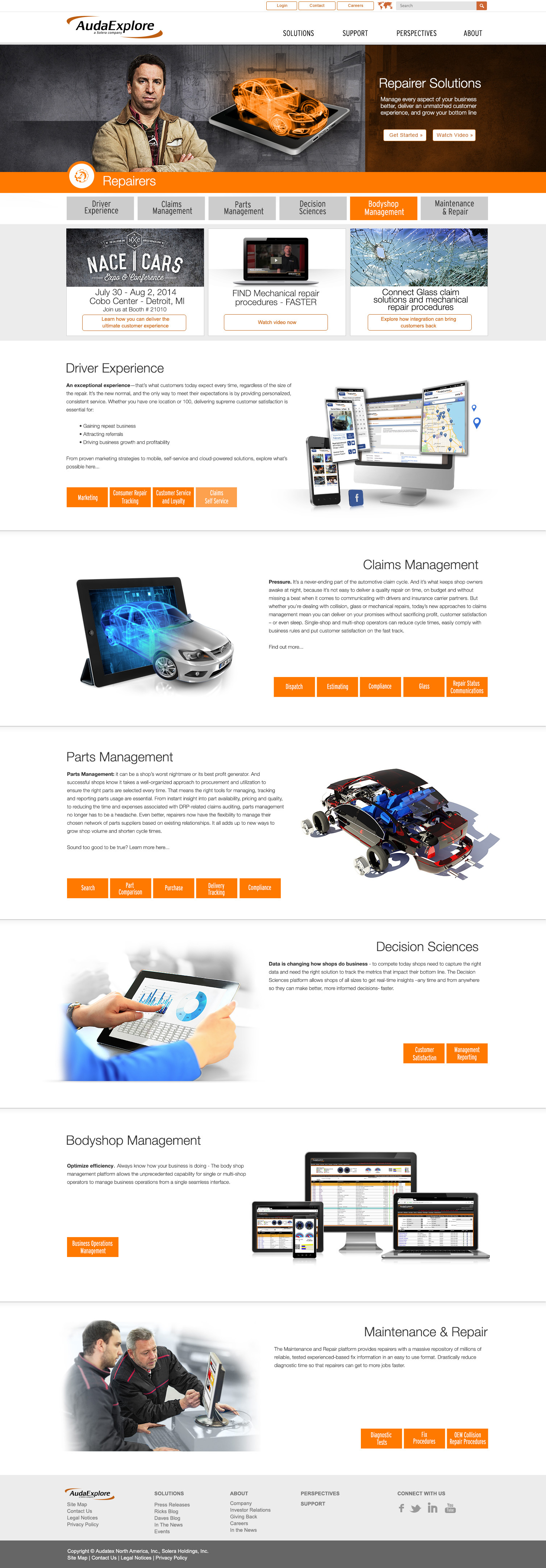
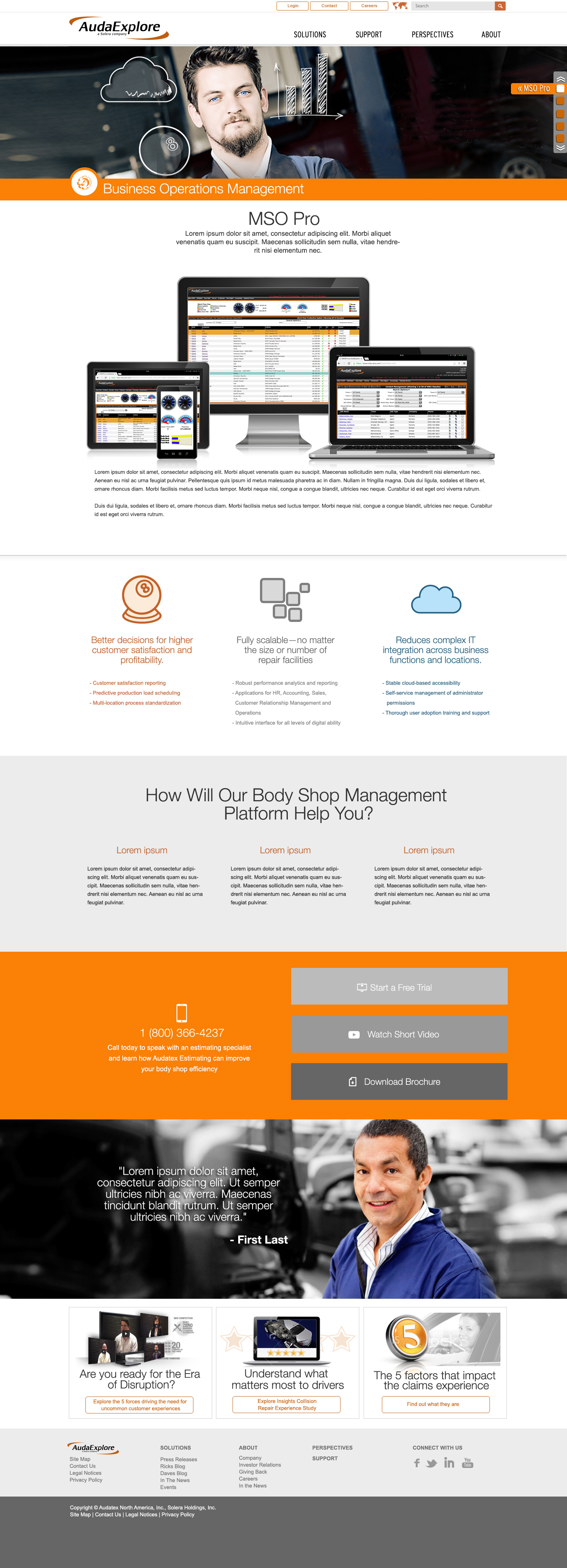
Working closely with the content team, I led the information architecture and wireframing phases of the project. The process began with card sorting exercises to understand how users naturally grouped and labeled content. Insights from these sessions informed the creation and refinement of the site map, ensuring intuitive navigation, logical page relationships, and alignment with both user expectations and business goals.
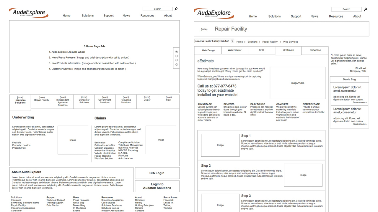
With the site map validated, I led the wireframing effort using Axure as the primary prototyping tool. I produced low- and mid-fidelity wireframes that defined page structure, user flows, and key interactions. This approach allowed us to validate content hierarchy early, align stakeholders, and deliver a clear, testable foundation for visual design and development.
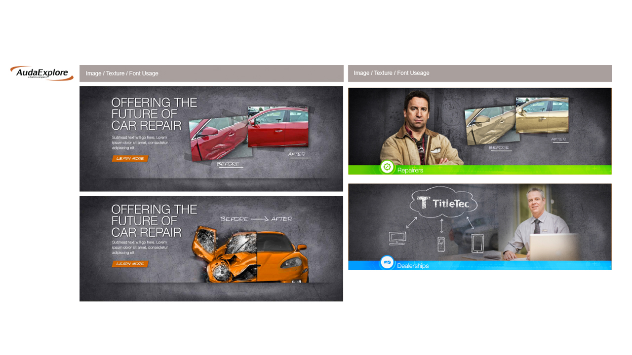
Industry Icons and Style Guide
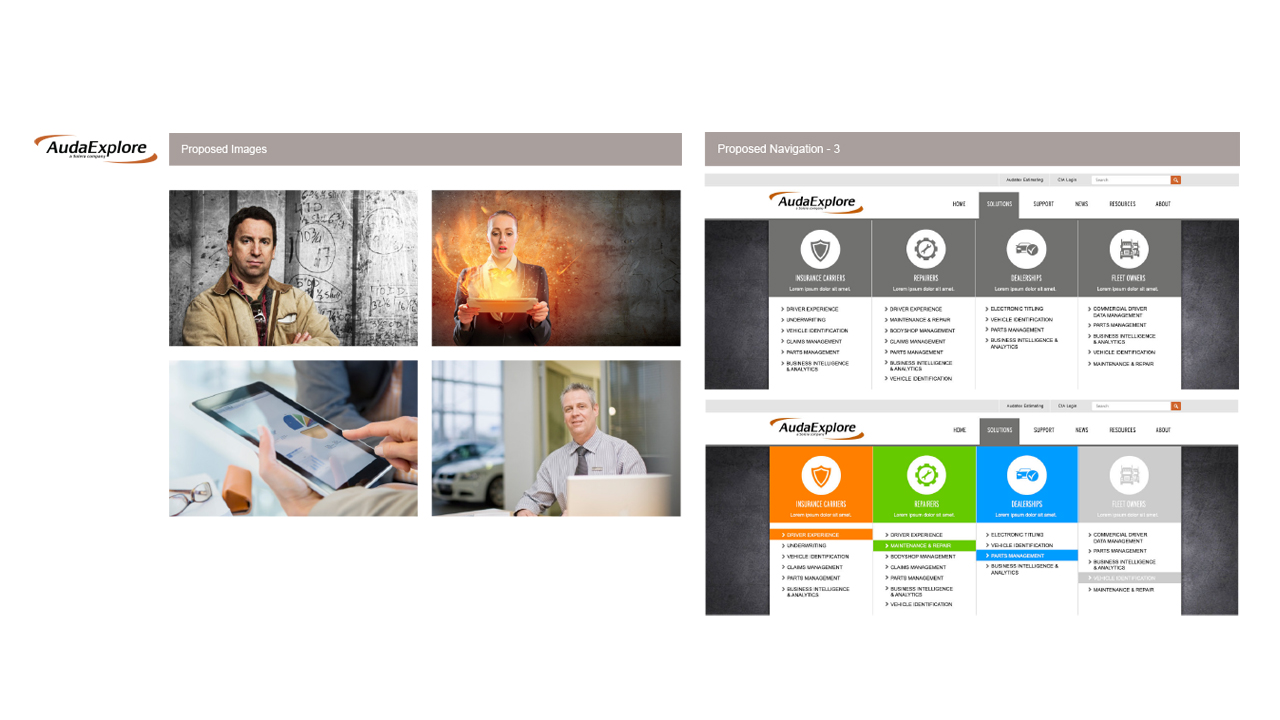
Once the wireframes were complete, the fun began. Drawing from our industry research and user-specific insights, I led the creation of the project’s style guides. These included detailed use cases for typography, custom iconography, color palettes, and imagery.
The goal was to establish a cohesive visual language that felt familiar, trustworthy, and aligned with the expectations of our users. By carefully defining color usage, image styles, and font hierarchy, we ensured a consistent experience across the site—one that made users feel comfortable, confident, and encouraged to explore further.
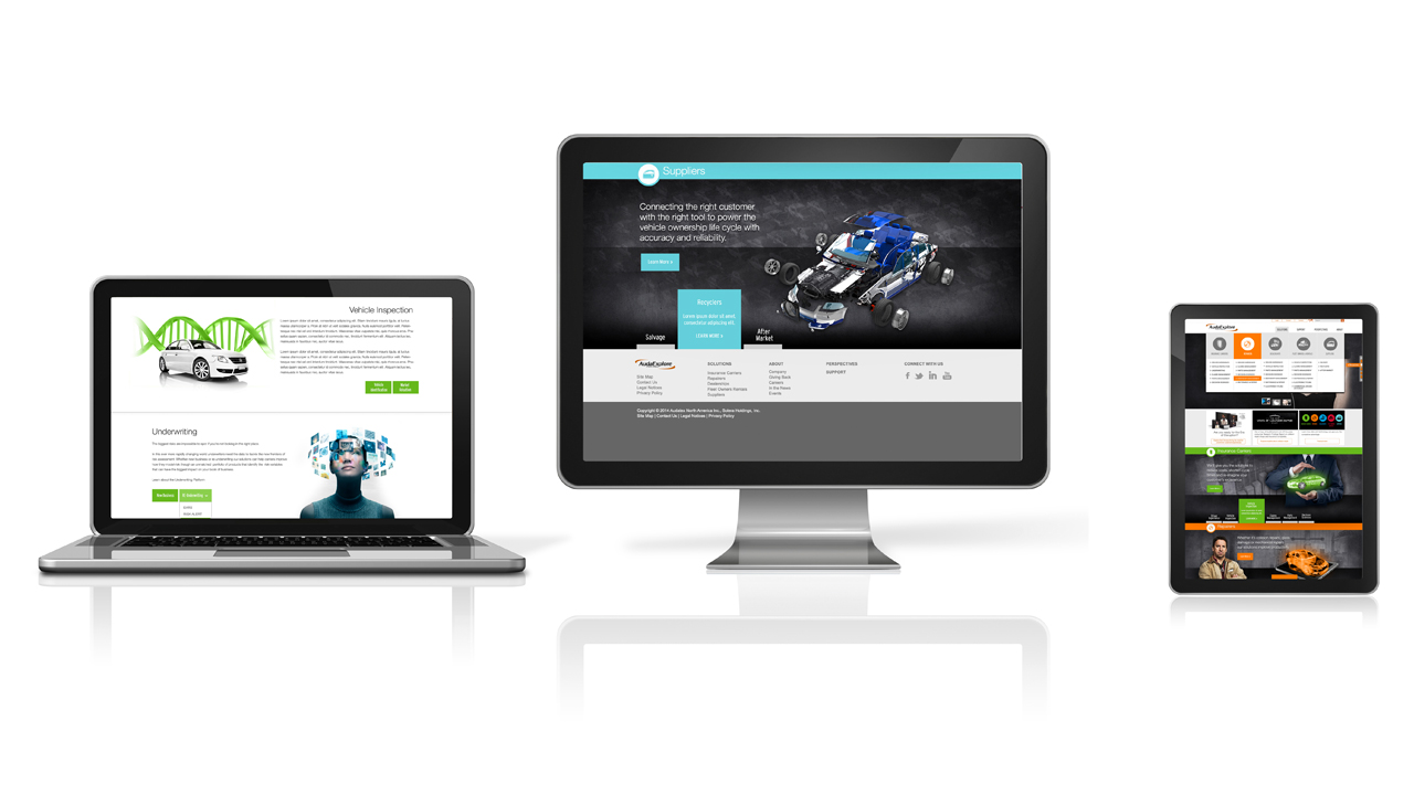
Final Outcome
Once the website launched, we received overwhelmingly positive feedback. Users shared that the site was significantly easier to navigate, and that finding the information they needed was far more intuitive compared to the previous experience. This validated our user-centered approach and confirmed that the new design successfully improved clarity, usability, and overall satisfaction.