MedFinder
With Agile 6 and Three Wire Systems we submitted this sample project for 18F contractor approval.
I lead research, UX and visual design collaborating with the team guided by human-centered principals with an agile approach.
As our submission the team set out to create a simple, easy and quick interface for the user to find information on their medication.
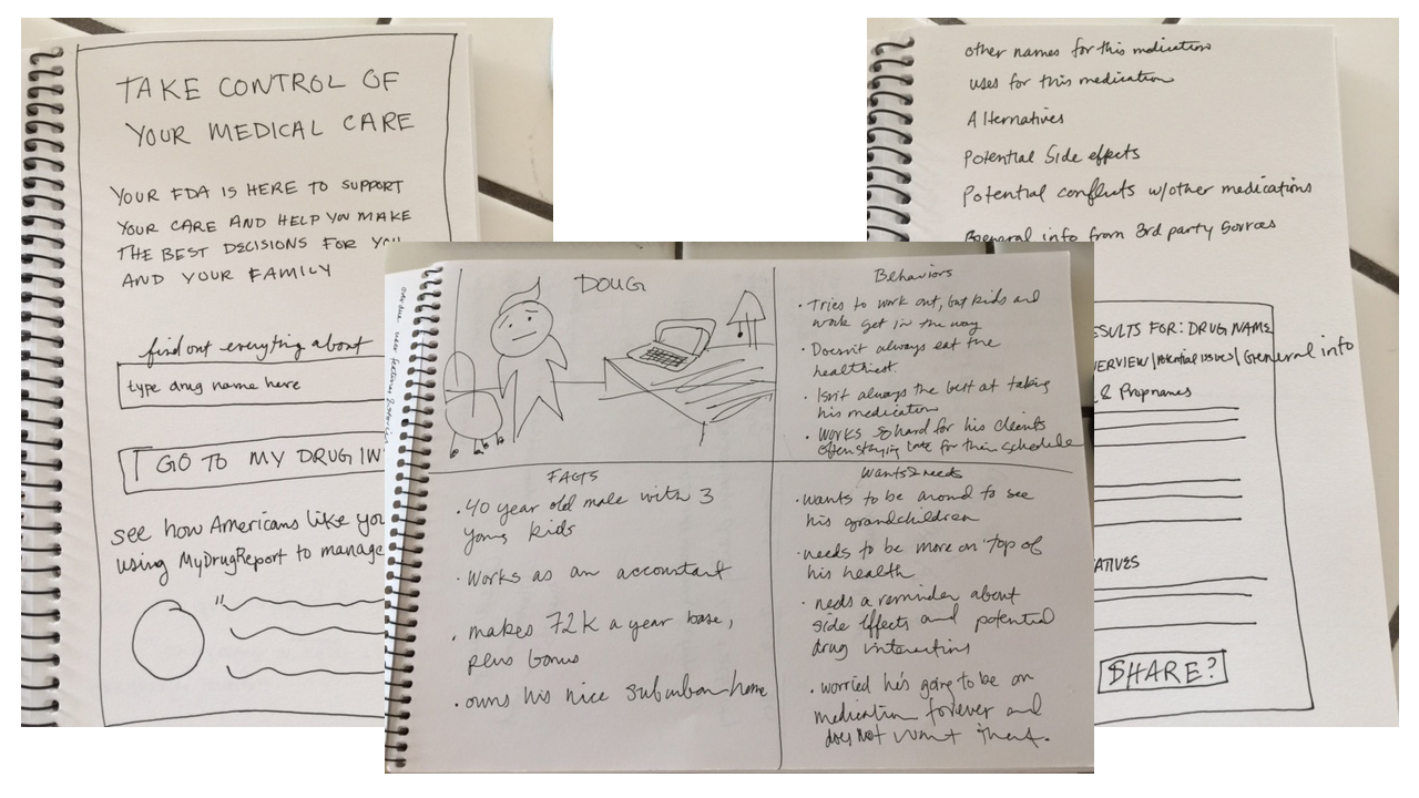
We began by delivering personas and basic wireframes based on the potential users.
Client
Agile6 and Three Wire Systems
My Role
Creative, UX
UX Design
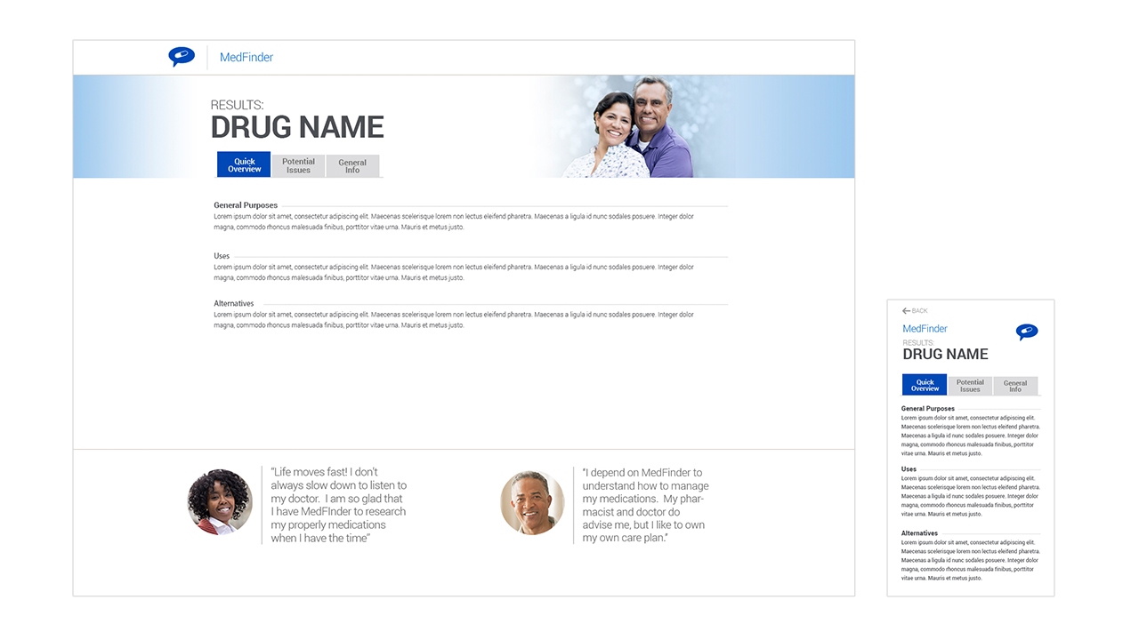
The next step was to design 2 main pages: Search and the Drug information page. The focus was to empower the user to be informed about the medication they were taking. Our goal was that they did not feel overwhelmed. We wanted them to feel comfortable and in control.


