Together 10
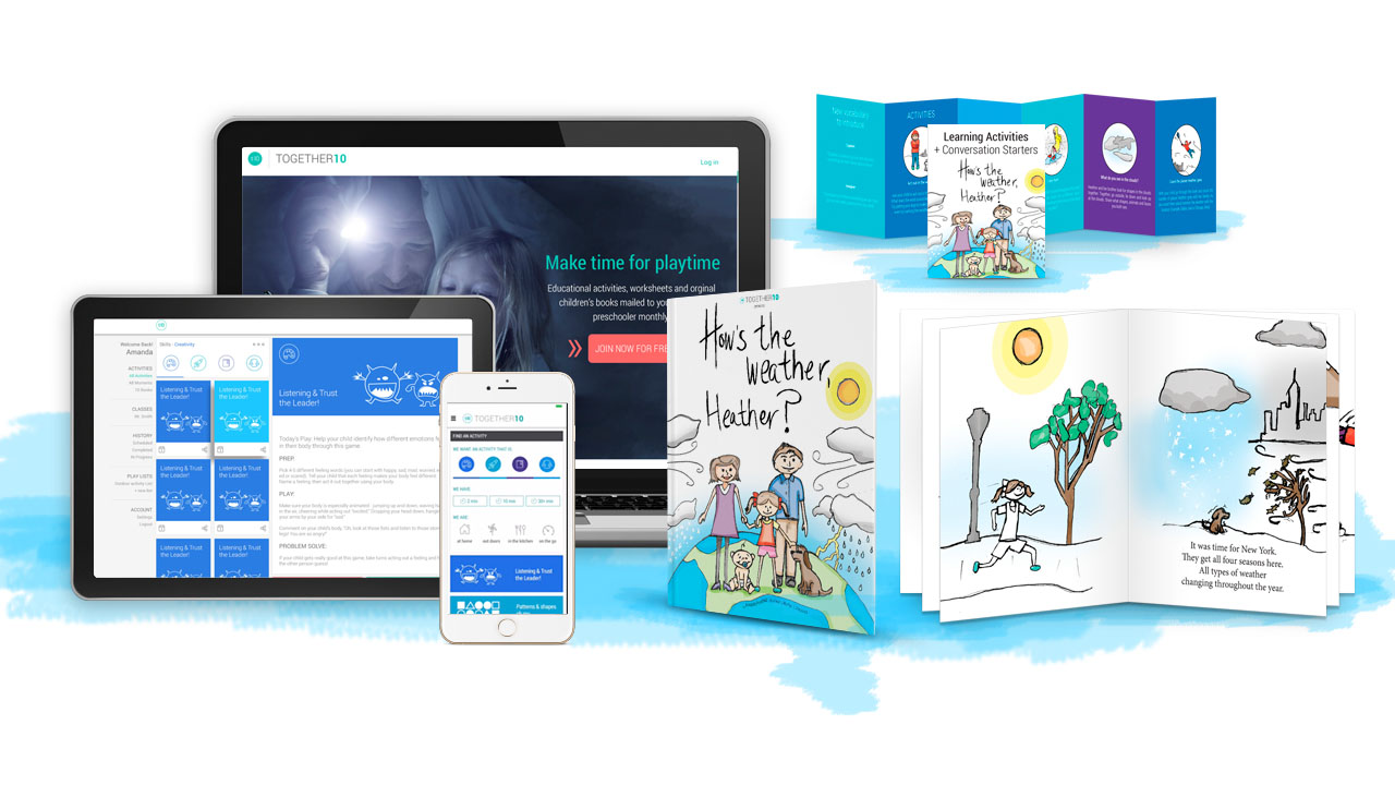
TOGETHER10 is a simple idea created to help parents connect with their children offline during their most formative years. We noticed there was an opportunity for a technology based platform using basic principals of Human-Centered design to make it fun and easy for Parents and Children to do activities together. The idea is simple: provide activity ideas that a parent can do with their child offline for 10min a day. The significant impact of this product is that these are 1 on 1 activities that require personal interaction offline. It is counter to the push for activities that are all on the computer and it is up to the child to figure it out.
Research and Testing
We began the project by interviewing Kindergarten Teachers to identify what they thought would best to prepare children for school. We discovered that the majority of the kids that were going into kindergarten were going in without many basic skills such as beginning counting, identifying the letters of the alphabet and simple word sounds. Many children, especially in struggling communities may not even know how to the pages of a book turn.
Our next step was to interview parents to find out what type of product we could build for them that would best help them prepare their children for school. We identified 3 major parental categories that we needed to work for: single parents, families where the mother or father are not home all the time, and families with a full-time stay at home parent. We heard consistently that parents wanted to spend time with their kids doing learning activities but there was not an easy way to do that and they needed more guidance, at their fingertips, to help them support their child’s learning in a fun way.
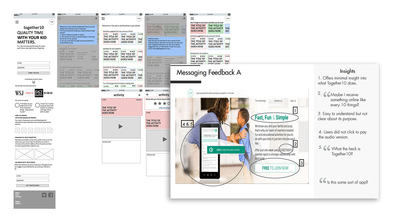
Base on our collected information, we began the process by creating wireframes of a product that could serve parents with ideas of easy, but impactful, activities they could do offline with their child in a few minutes a day.
Before we went into the visual design phase we used wireframes to outline our needs and put in front of real parents to gauge their usability and functionality.
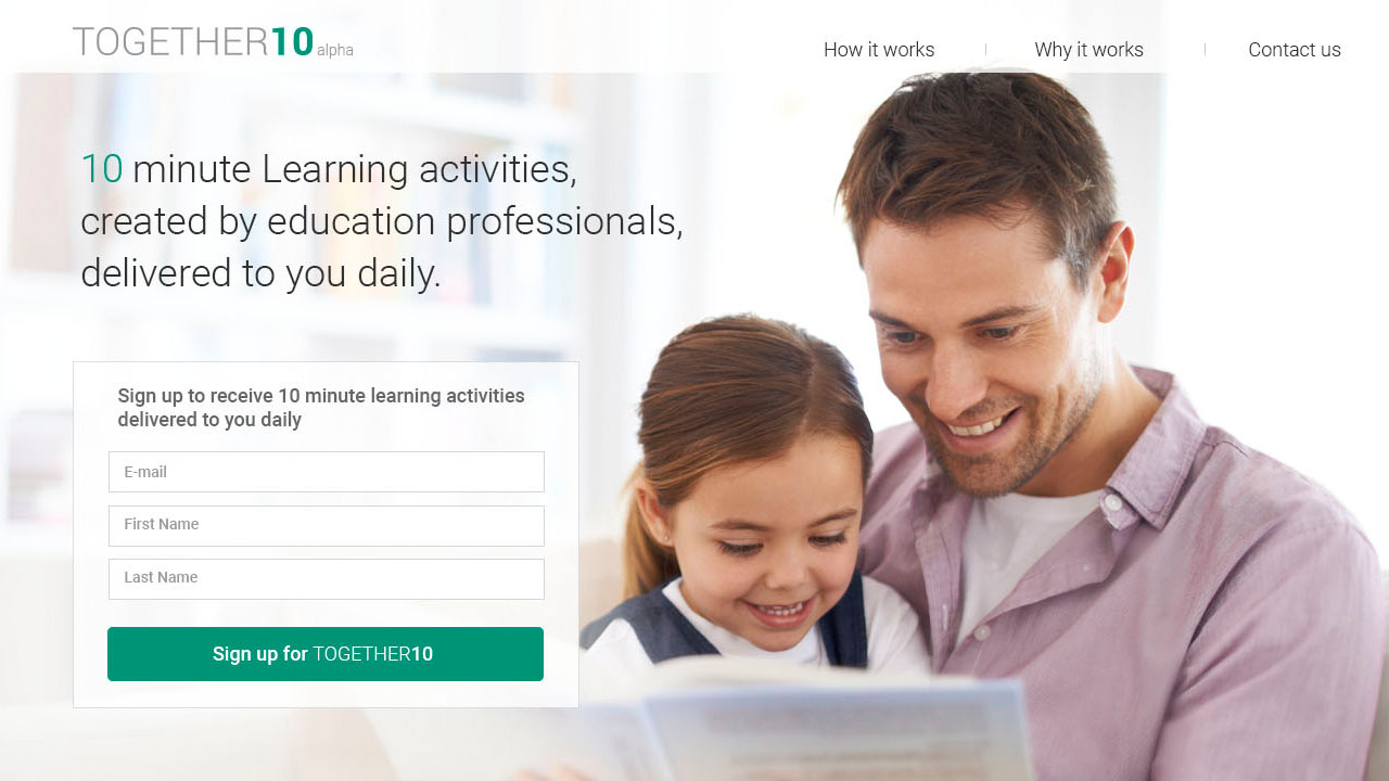
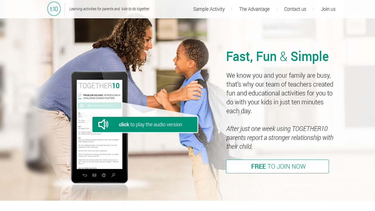
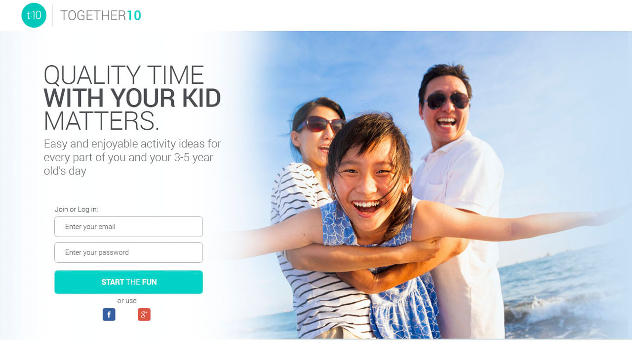
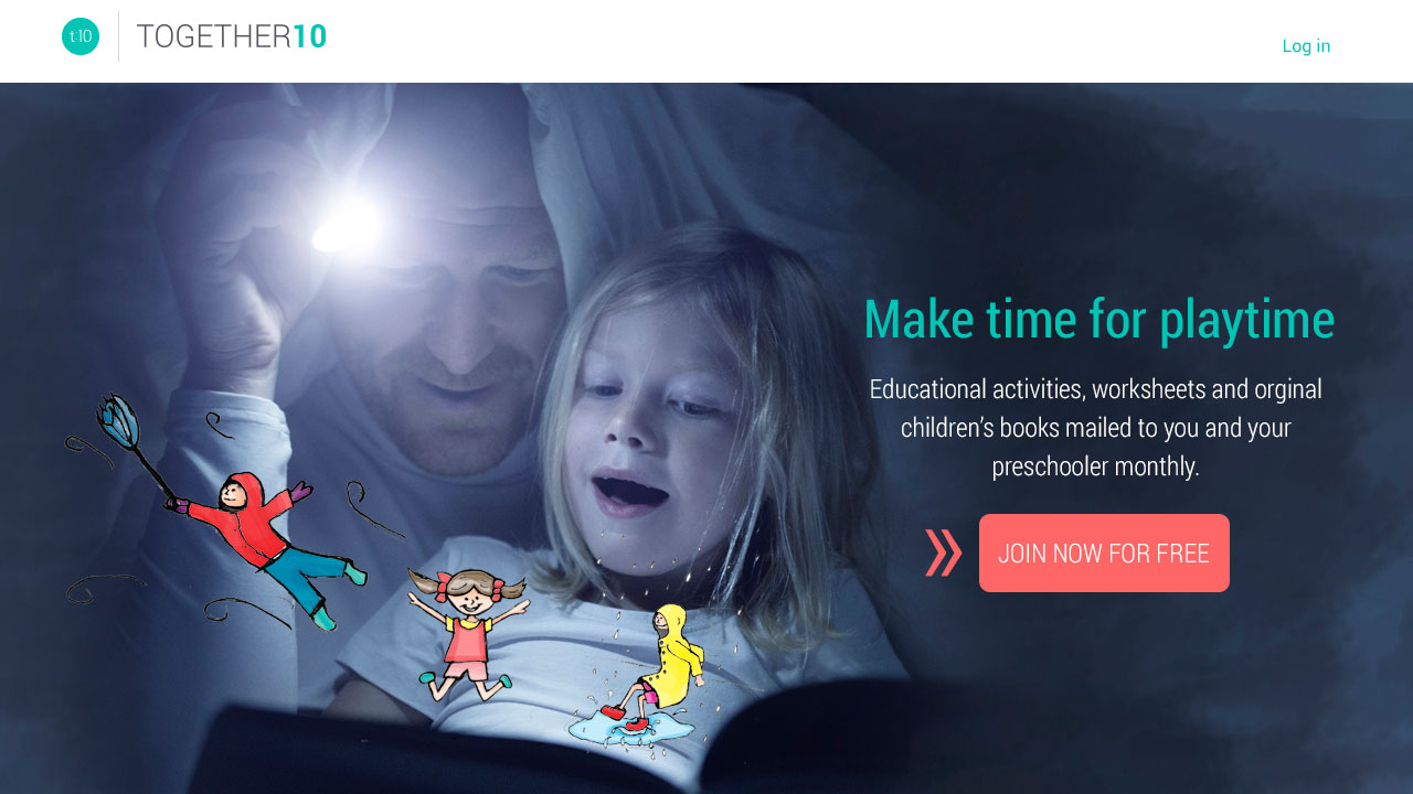
When we were ready to build we also ran numerous a/b tests. A major initiative we did was to put out multiple different landing pages to identify what tag lines and imagery was clearest and lead to the highest conversion rates. Doing this helped us better define the message and product that would best connect with our audience. The concepts included:
1) 10 Minute learning activities, created by education professionals delivered to you daily
2) Fast, Fun & Simple
3) Quality time with your kid matters
4) Make time for playtime
Spending a small amount on google and facebook ads targeting our assumed audience we tested the prototypes. We also put out ads on craigslist using an easy survey to screen our audience to do even more in depth product usability testing as well as to get feedback on their understanding of the product and how it could fit into their everyday lives.
From this work we discovered that “Make time for Playtime” version was the most compelling and that the product needed to be at the parent’s fingertips and usable at a moment’s notice.
Client
Together 10
My Role
Creative, UX
Style Guide
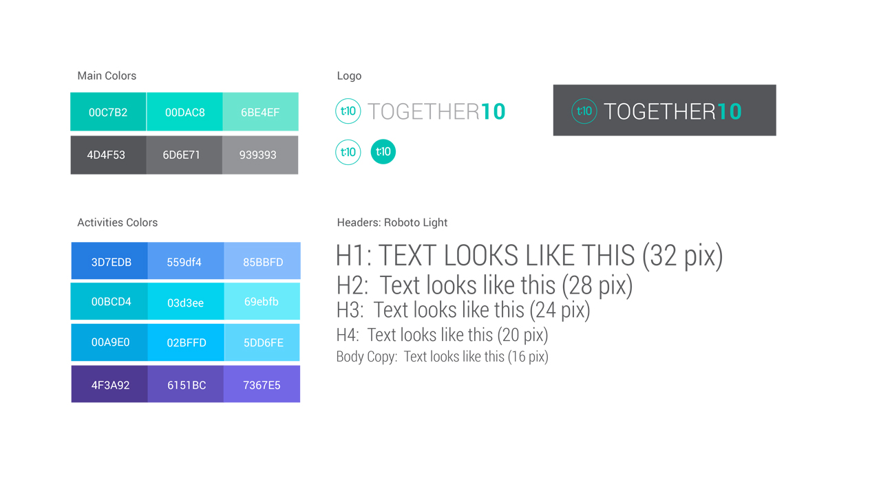
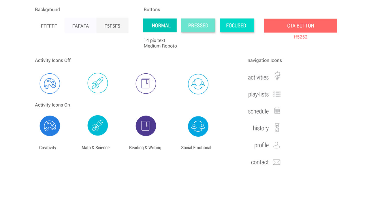
With the info we gathered we were ready to take a more targeted approach for the back end interface and start designing the user experience and creating a style guide. This is where we take fonts, color, illustrations, and clear call to actions to help create the design. This will help keep consistency for developers follow during the development process.
Design
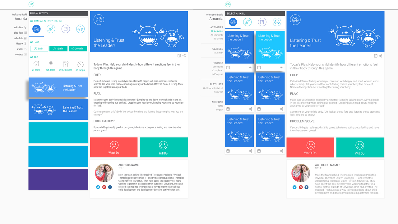
During the design process I had to take into consideration a few elements. We needed to keep the activities easy to find. This was solved when we broke them into categories of interest. These categories included:
1) Creativity
2) Math and Science
3) Reading and Writing
4) Social and Emotional
Once the categories were working, we created actives for each section. I in term created illustrations for each activity.
There were also some other filter options we need to take into consideration.
1) Time of each of the activities
2) The location of the activities
Tangible Product Creation
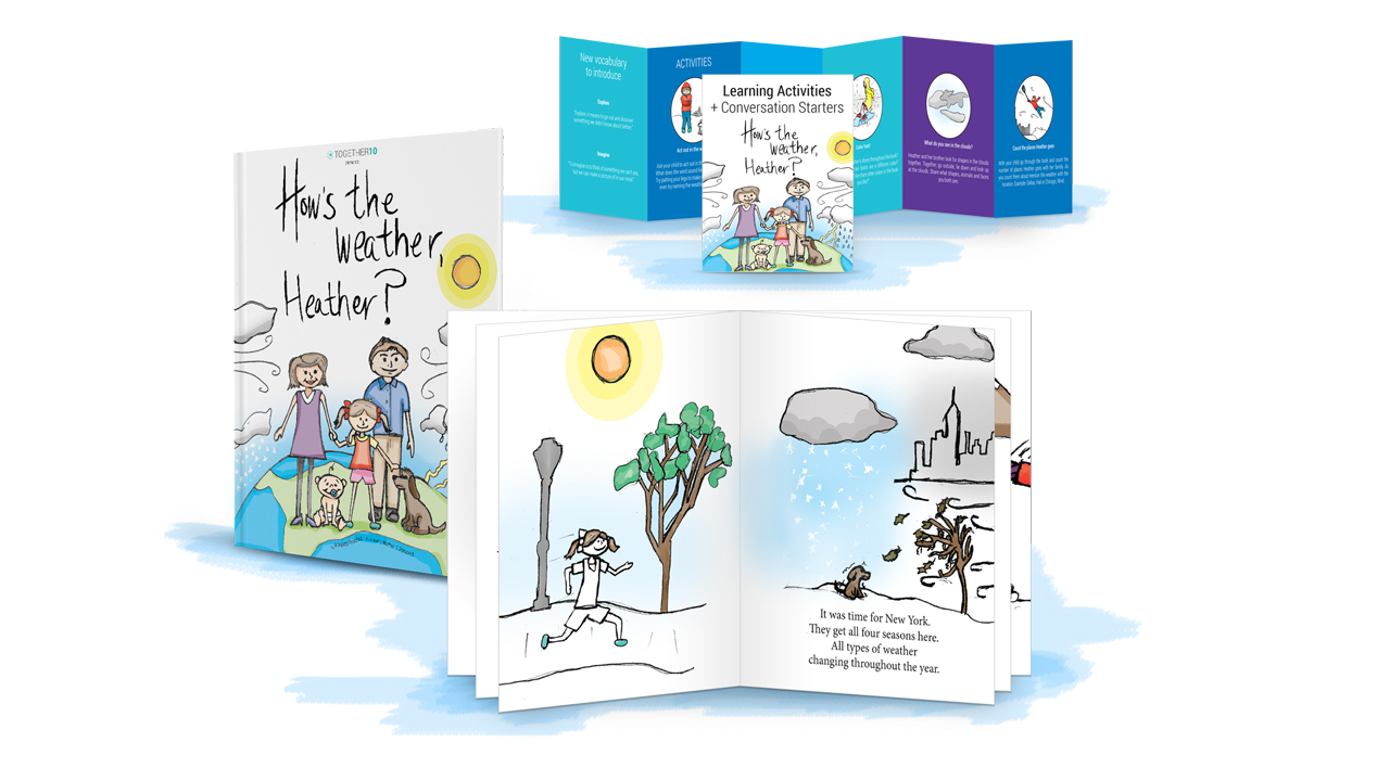
While in the beginning phases of launching the digital product, by listening to our early adopters we discovered that there was a need for a hands on product to accompany the site. We needed something that could be sent home that parents could play with their child. We came up with a Children’s book “How’s the Weather Heather” that included an activity guide after the book was read with your child.
This ended up being the best way to convert users to clients as when they signed up they were entered into a giveaway raffle to receive this item as a gift.
